

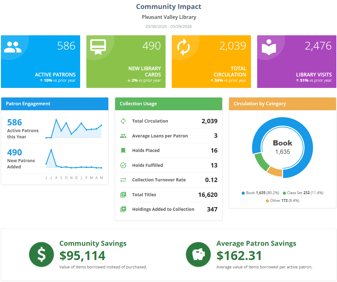
The Community Impact report tells the story of how your library serves the people around it. In a single, attractive page it brings together the numbers that matter most — how many people you reached, how much they borrowed, how your collection is being used, and the real dollar value your library returns to the community.
It's a wonderful tool for understanding your library at a glance, and it's just as valuable when you need to show others what your library is worth. The metrics and the estimated community savings are designed to be shared with the people who support you — administrators, boards, councils, and funders — so the difference your library makes is easy to see and easy to celebrate.
You'll find the Community Impact report under Insights in the main menu.
Setting your Options
Before you view the report, you choose a few options that define the time span it covers. Surpass fills in sensible defaults, so you can simply click Next - View Report to get started, or adjust the options to match what you want to show.

| Option | What it does |
|---|---|
| Period | Sets the length and type of the reporting window. Year covers a rolling 12 months ending on the date you choose; Month covers a rolling month; Calendar Month lets you pick a single, complete calendar month; and Calendar Year lets you pick a single, complete calendar year. |
| Start date | The first day of the period. When you choose Calendar Month or Calendar Year, the date picker switches to selecting a month or a year so the period always lines up neatly with the calendar. |
| Comparison | Chooses the earlier period that the report compares against, so you can see whether each number is up or down. For year-length periods this is always Prior Year. For month-length periods you can compare against either the Prior Month or the same month in the Prior Year. |
If your library doesn't yet have data going back far enough to fill the comparison period, the report simply leaves the comparison out and shows the current numbers on their own.
Reading the report
The report opens with your library's name and the exact date range it covers, followed by the panels described below. Wherever a number can be compared with the earlier period, you'll see a small percentage with an up or down arrow showing the change.
Headline Metrics
Four colorful cards at the top summarize the period:
- Active Patrons — the number of distinct patrons who had at least one tracked interaction with the library during the period (a checkout, renewal, check-in, hold, or online catalog review). It's a count of the people your library actively served.
- New Library Cards — the number of new patron records created during the period. A healthy stream of new cards shows your library is continuing to attract members of the community.
- Total Circulation — the total number of checkouts recorded during the period.
- Library Visits — a measure of how often patrons engaged with the library. Surpass counts the number of days on which each patron had a trackable interaction (a checkout, check-in, renewal, hold, or online review) and adds those up across all patrons. In other words, one patron who was active on ten different days counts as ten visits. Because it's based on recorded transactions, it does not include people who visited without borrowing, returning, or otherwise interacting with their account.
Patron Engagement
This panel highlights how your patron community grew and stayed active over the months in the period:
- Active Patrons this Period — the same active-patron count described above, shown with a small trend line of how it moved month by month.
- New Patrons Added — new patron records created during the period, again with a month-by-month trend line.
Collection Usage
A quick rundown of how the collection was put to work:
- Total Circulation — total checkouts during the period.
- Average Loans per Patron — total circulation divided by the number of active patrons, showing how much the typical patron borrowed.
- Holds Placed — the number of hold requests patrons placed during the period.
- Holds Fulfilled — the number of holds that were filled (the item was provided to the patron) during the period.
- Collection Turnover Rate — the average number of times each item in the collection circulated during the period (total circulation divided by the total number of items). A higher turnover rate means your collection is working hard.
- Total Titles — the number of distinct titles in the collection as of the report's end date.
- Holdings Added to Collection — the number of new holdings added during the period.
Circulation by Category
A donut chart that breaks total circulation down by resource category, so you can see at a glance which kinds of materials your community reaches for most.
Community Savings
This is one of the most powerful parts of the report for demonstrating value, because it puts a dollar figure on the benefit your library provides:
- Community Savings — an estimate of how much money your community saved by borrowing instead of buying. Surpass looks at every checkout in the period and adds up what those items would have cost to purchase. For each item it uses the item's recorded cost when available, or the list price found in the catalog record, and adjusts older prices to today's dollars for a fair comparison. When an item has no price recorded, Surpass estimates it from the typical (median) price of items in the same category. The result is a conservative, dependable estimate of the purchasing power your library delivered.
- Average Patron Savings — Community Savings divided by the number of active patrons, showing the value the typical patron received.
If your library is using the $ option for currency in Regional Settings, costs are adjusted for inflation using the U.S. Federal Reserve Bank's Consumer Price Index for goods not including food and fuel.
If no cost information is available anywhere in your collection, the savings panel is simply hidden.
Footer Notes
Below the panels, a short caption restates the comparison period in plain language (for example, the exact dates of the prior year). When the savings figures include prices that were adjusted for inflation, a brief note explains that as well.
A note about the bottom row
On the other Insights reports, the bottom row is reserved for automatically generated insights that change depending on your data. The Community Impact report is the exception: its bottom row is the fixed Community Savings panel described above, which always shows your community savings and average patron savings rather than rotating highlights.
Viewing, Printing, and Downloading
From the View Report step you can print the report or download it as a PDF using the buttons at the top of the panel — handy for attaching to a board packet or annual report. See Viewing and Printing Reports.