

The Collection Effectiveness report helps you understand how your collection is actually being used. It shows which categories and collection areas are pulling their weight, where circulation is growing or shrinking, and how a relatively small part of the collection often drives a large share of the activity.
It's a friendly, practical guide for collection development — and it's also a great way to show your community and funders that the materials budget is being spent wisely, with the collection earning its keep. The report turns raw circulation into clear, actionable patterns.
You'll find the Collection Effectiveness report under Insights in the main menu (labeled Collection).
Setting your Options
Surpass fills in sensible defaults, so you can click Next - View Report right away or adjust the options first.

| Option | What it does |
|---|---|
| Period | Sets the length and type of the reporting window. Year covers a rolling 12 months; Month covers a rolling month; Calendar Month lets you pick one complete calendar month; and Calendar Year lets you pick one complete calendar year. |
| Start date | The first day of the period. For Calendar Month and Calendar Year, the date picker switches to choosing a month or year. |
| Comparison | The earlier period the report compares against. For year-length periods this is always Prior Year; for month-length periods you can choose Prior Month or the same month in the Prior Year. |
If your data doesn't reach back far enough to fill the comparison period, the report shows the current numbers without a comparison.
Reading the Report
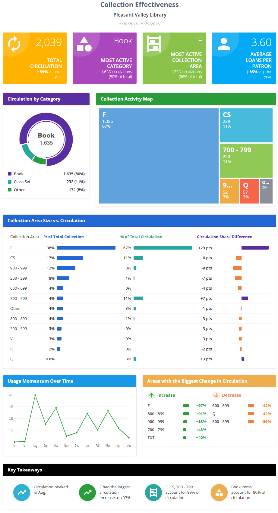
The report opens with your library's name and the date range, then presents the panels below. Numbers that can be compared with the earlier period show a small percentage with an up or down arrow.
Headline metrics
- Total Circulation — the total number of checkouts recorded during the period.
- Most Active Category — the resource category with the most checkouts during the period, along with its circulation count and its share of total circulation.
- Most Active Collection Area — the collection area with the most checkouts during the period, along with its circulation count and share of the total.
- Average Loans per Patron — total circulation divided by the number of active patrons, showing how much the typical patron borrowed.
Circulation by Category
A donut chart breaking total circulation down by resource category, so you can see which kinds of materials are most popular.
Collection Activity Map
A treemap that shows the collection's activity visually — larger blocks represent areas with more circulation — giving you an at-a-glance map of where the action is.
Collection Area Size vs. Circulation
A table comparing each collection area's share of the collection with its share of circulation:
- % of Total Collection — how large the area is, by number of titles.
- % of Total Circulation — how much of the library's circulation it accounts for.
- Circulation Share Difference — the circulation share minus the collection share. A positive number means the area circulates more than its size would suggest (it's punching above its weight); a negative number means it circulates less.
Usage Momentum Over Time
A chart of total circulation month by month, so you can see whether overall usage is gaining or losing momentum across the period.
Areas with the Biggest Change in Circulation
Two short lists — Increase and Decrease — highlighting the collection areas whose circulation changed the most compared with the prior period. They make it easy to spot rising interests and areas that may need attention.
Key Takeaways (the bottom row)
The bottom row of the Collection Effectiveness report is a set of automatically generated Key Takeaways. Surpass examines the report's data, builds a list of candidate insights, and displays the strongest few (up to four). Because they're chosen from your actual data, the takeaways you see will vary from one library and period to the next. The possible takeaways include:
- Circulation concentration — when the top 10% of titles account for a large share of circulation, highlighting how a small set of titles drives much of the activity.
- Collection area concentration — when the top three collection areas together account for a majority of circulation.
- Area share difference — when a single area circulates far more than its size would suggest (for example, "X represents 8% of titles but 22% of circulation").
- Category leader — when one category accounts for a large share of total circulation.
- Growth area — the collection area with the largest increase in circulation compared with the prior period.
- Declining area — the area with the largest decrease in circulation compared with the prior period.
- Usage momentum — when circulation clearly peaked in a particular month.
- Category diversity — when circulation was spread across many active categories, showing a broad, well-used collection.
When more takeaways qualify than there's room to show, Surpass favors the most significant ones and generally leads with positive or neutral findings over declines.
Footer Note
A short caption beneath the report restates the comparison period in plain language.
Viewing, Printing, and Downloading
From the View Report step you can print the report or download it as a PDF using the buttons at the top of the panel — handy for attaching to a board packet or annual report. See Viewing and Printing Reports.